Kaphal Studio
Delhi, India — January 2025
Client
Visionary Creative Studio
Date
June 2024
Industry
Education & Design Preparation
Scope of work
Full Website
UX/UI Design
No-code Development
Overview
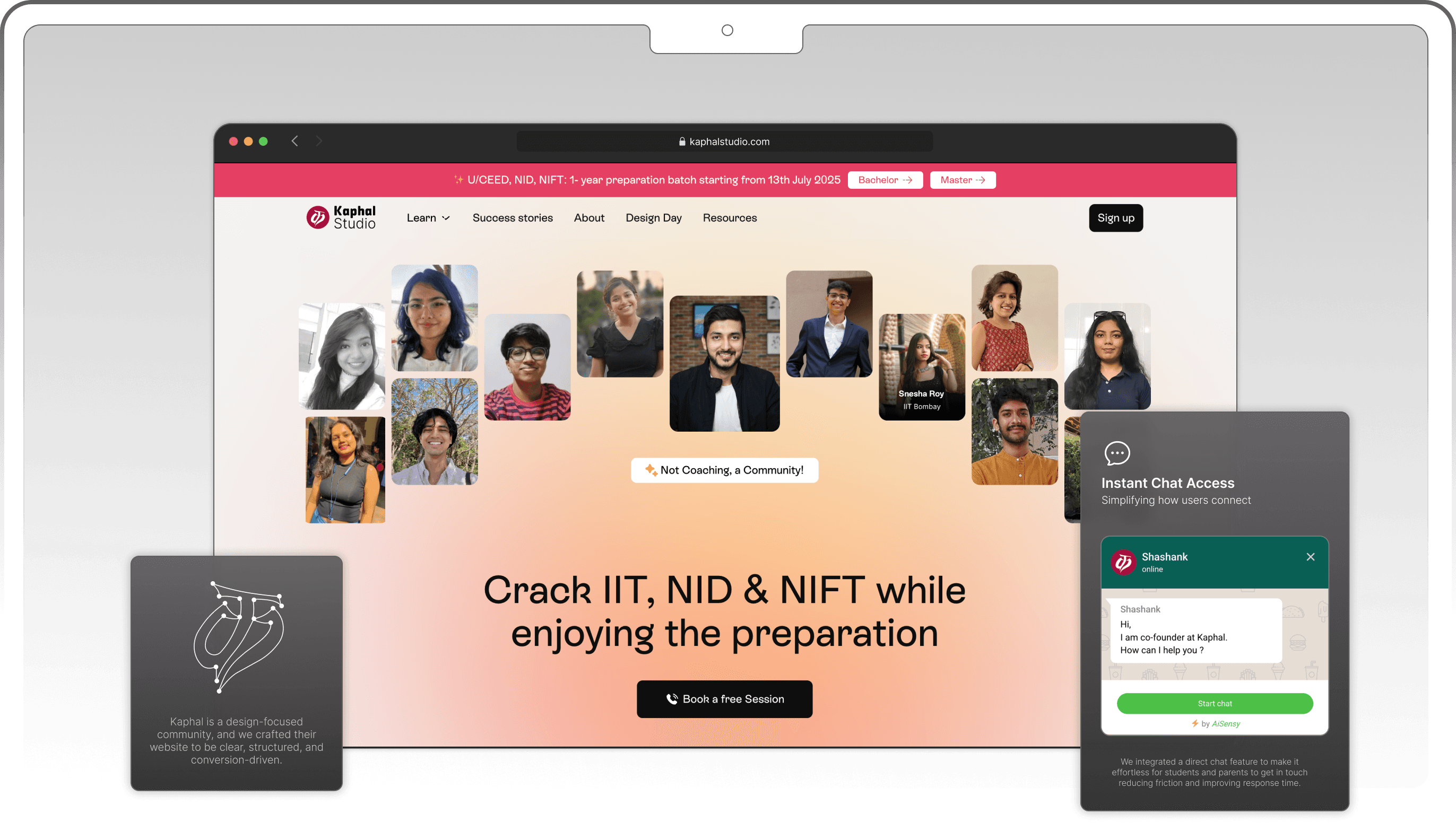
The Kaphal Studio website redesign was driven by a vision to authentically reflect the brand’s core identity as a creative, community-oriented learning space. Our goal was to elevate trust and clarity through intuitive UX/UI design, resonating deeply with students and parents alike. By applying the Double Diamond methodology and adhering to our North Star principles of trust and clarity, we transformed the digital experience, resulting in increased engagement, clear navigation, and significantly improved conversion rates.
HIGHLIGHT
We redesigned Kaphal Studio’s website to reflect their mission, build trust, and boost clarity. From structure to storytelling, every scroll now leads to action.
01 Homepage motion concept.
VIDEO LOOP
The Problem
This wasn't going to be your typical website redesign.
A pile-up of unique challenges.
Kaphal Studio had built an incredible online presence and vibrant learning environment. However, their website wasn't aligned, it didn't feel authentic, intuitive, or reassuring enough to attract new students or parents.
The decision was made to build a completely reimagined website from scratch, but we faced some unique constraints and challenges:
A tight, one-month timeline, leaving little room for iterations and delays.
Dual-audience balancing act. Designing equally for students (engaging, intuitive) and parents (trustworthy, clear, reassuring).
Poor mobile experience. Many users left due to frustrating mobile navigation.
Low conversion rates. Visitors weren’t becoming leads or sign-ups.
THE CHALLENGE
Transform a confusing, outdated website into a clear, trustworthy digital experience that genuinely reflects Kaphal Studio’s identity and drives conversions.
North Star design principles:
Build Trust
Design that feels credible, warm, and parent-friendly.
Prioritize Clarity
Simple words. Clear paths. No confusion.
Create Connection
Highlight real stories to spark emotion and trust.
The Strategy
Where We Started
Before jumping into design, we needed to rethink everything from the ground up.
We broke down the problem into 3 core areas:
Clarity
What’s the simplest way to help a parent or student understand Kaphal?
Trust
What signals build immediate credibility and emotional safety?
Navigation
How do we surface the most important content without clutter?

Ayush
Aditya
Dikshita
Abhishek
01 Homepage motion concept.
IMAGE
Our Process
STEP - 1
Research & Audit
Before opening Figma, we opened our ears.
We interviewed the founders, reviewed their old site, and studied how parents and students interacted with it. This helped us identify key friction points: too much information, scattered messaging, and no clear flow.
Our goal became clear: say LESS, but mean MORE.
STEP - 2
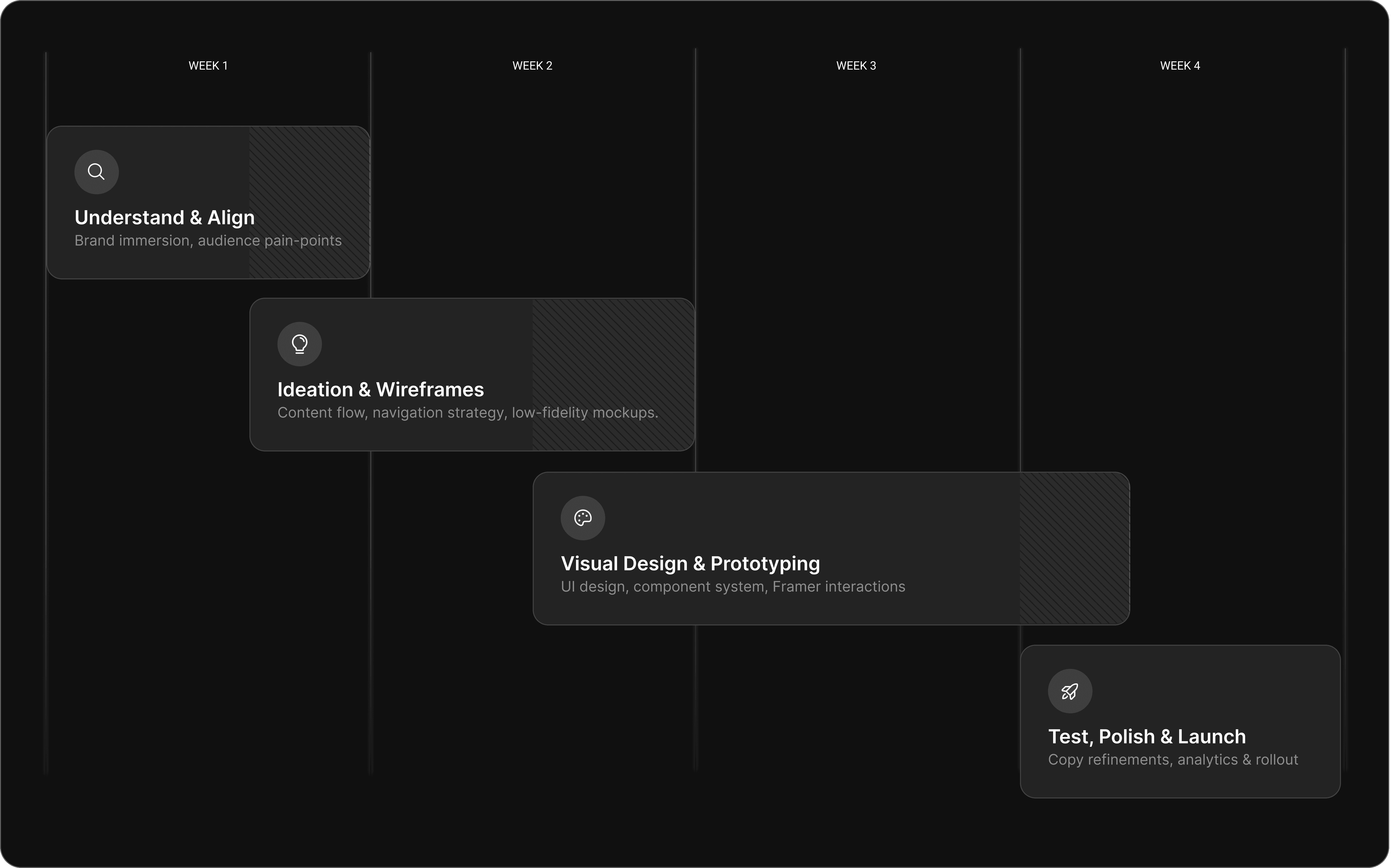
Site Map & Flow
Once we knew what Kaphal needed to say, we focused on how to say it, and how quickly users could find it.
We designed a scroll-first structure where everything important is just 3 clicks (or less) away.
Whether the visitor is a curious parent, a student looking to join, or a brand partner, the path is clear:

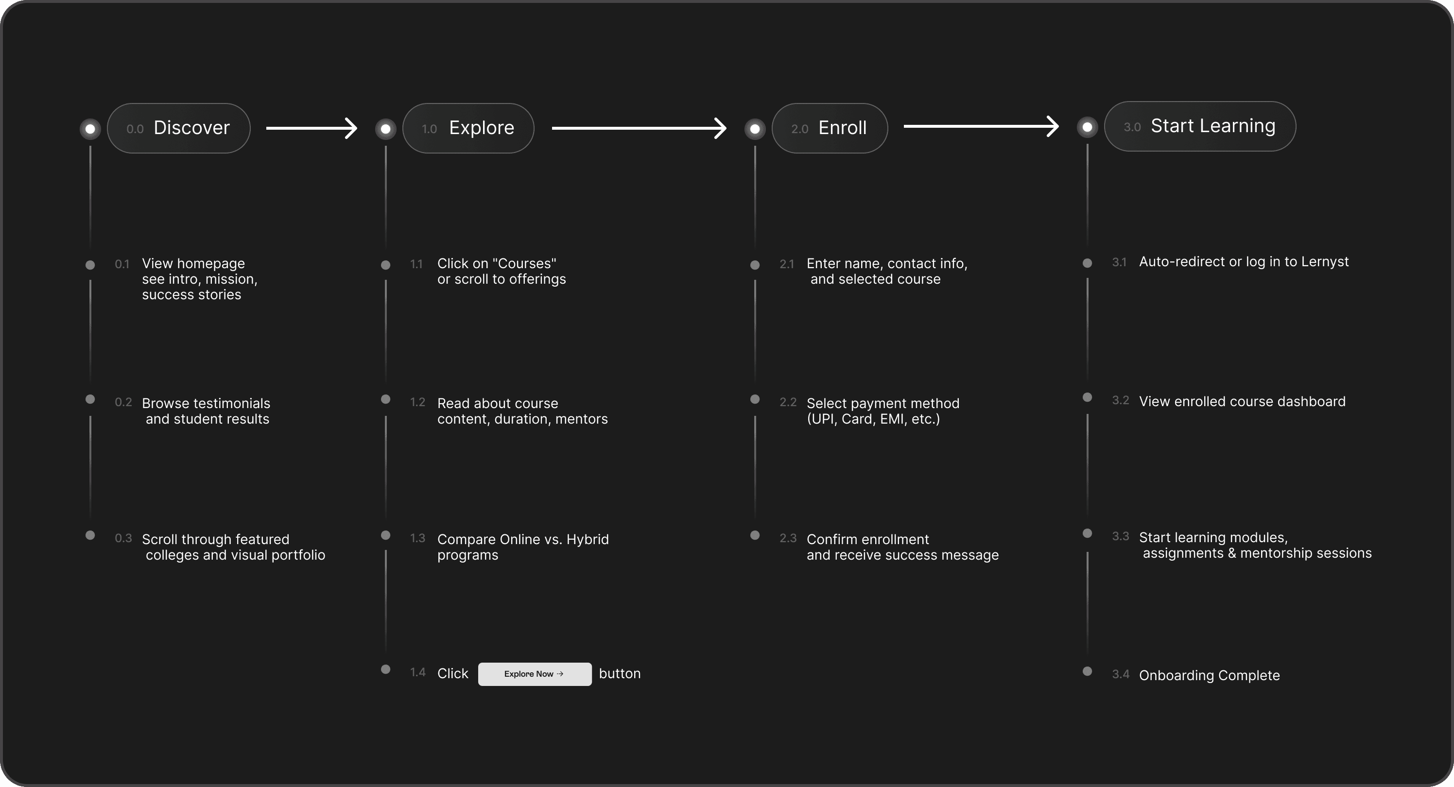
Curiosity
Clarity
Action
STEP - 3
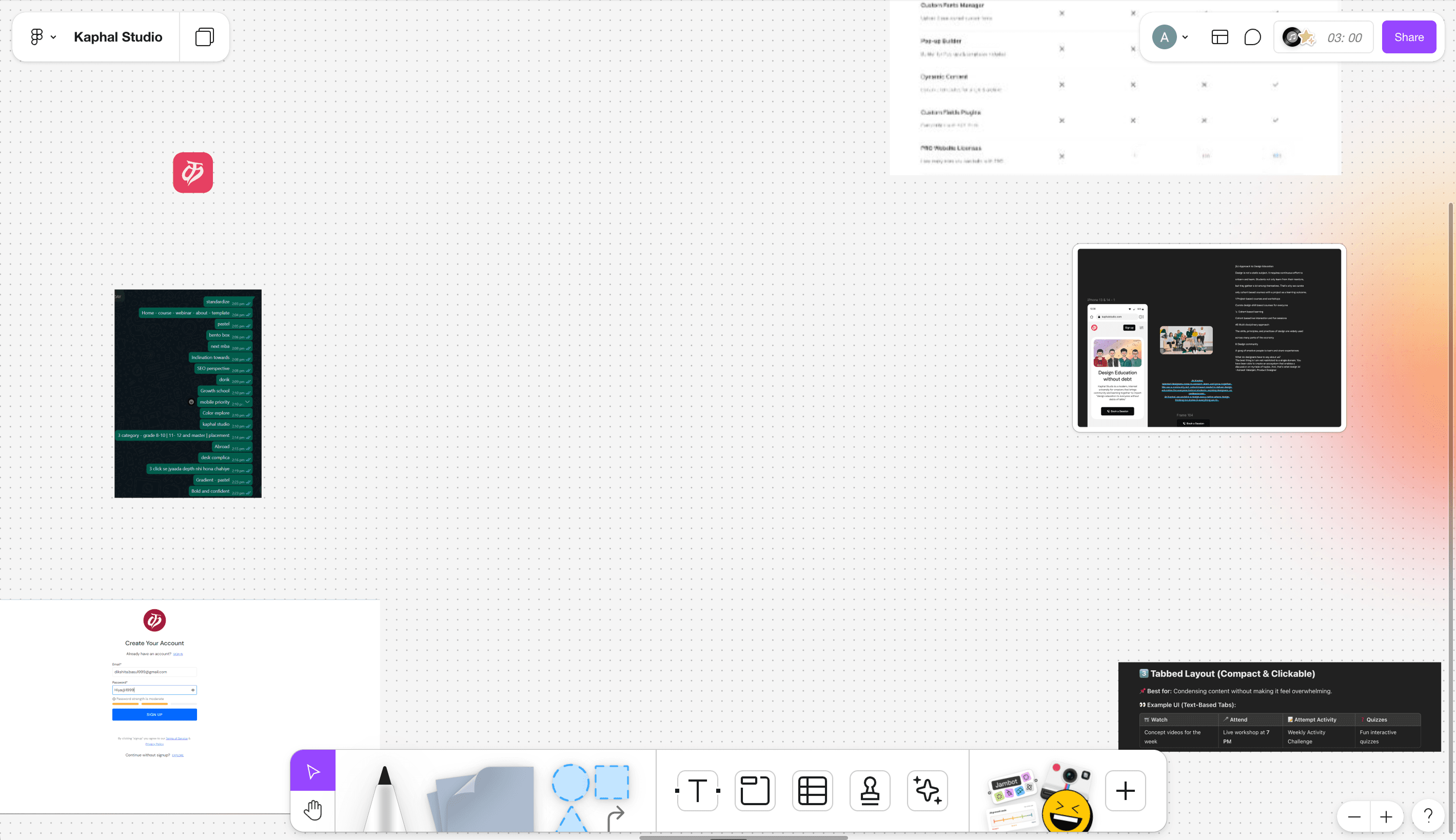
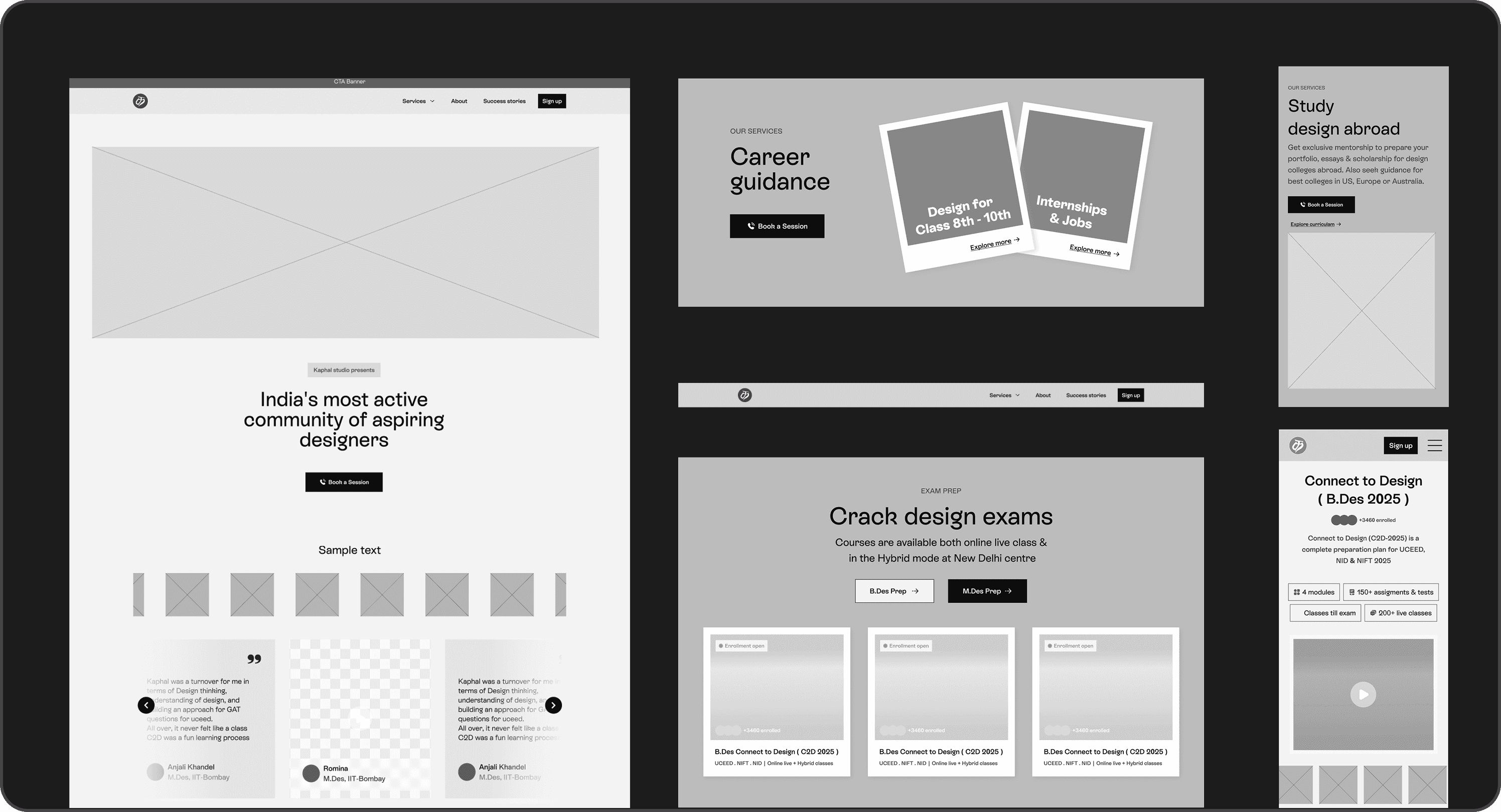
Low-Fidelity Wireframes
Before the polish, we focused on structure.
Using low-fidelity wireframes, we tested the layout, flow, and hierarchy of content, making sure that key information stood out and distractions were eliminated.
It helped us answer:
“If someone only scrolls for 10 seconds, will they get it?”
The Solution
Clarity
The old homepage left visitors confused, too vague, not enough direction.
We rewrote the copy, upgraded the layout, and used visuals to explain things faster.
Show Details
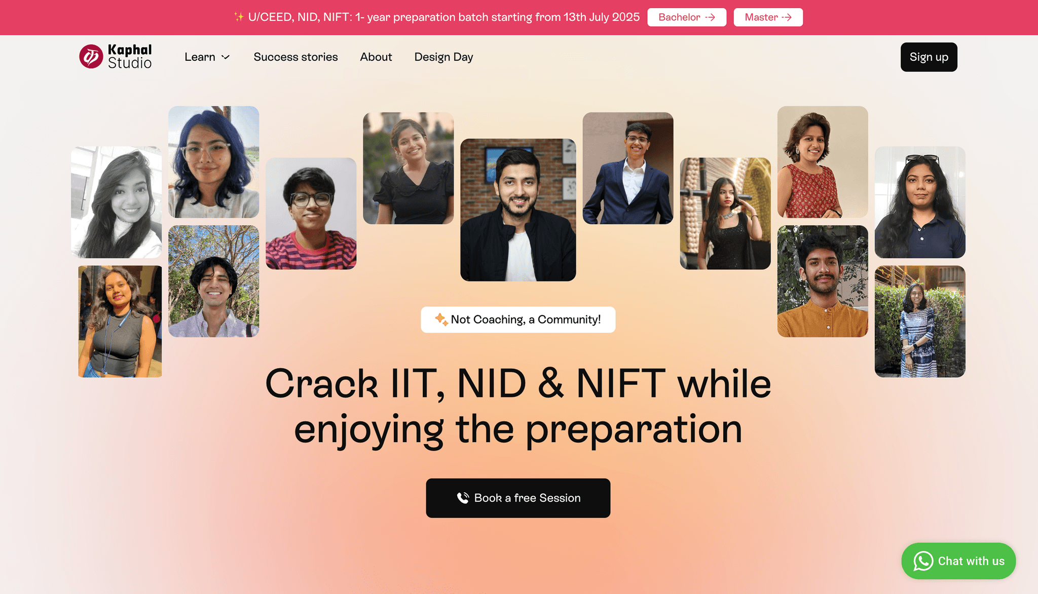
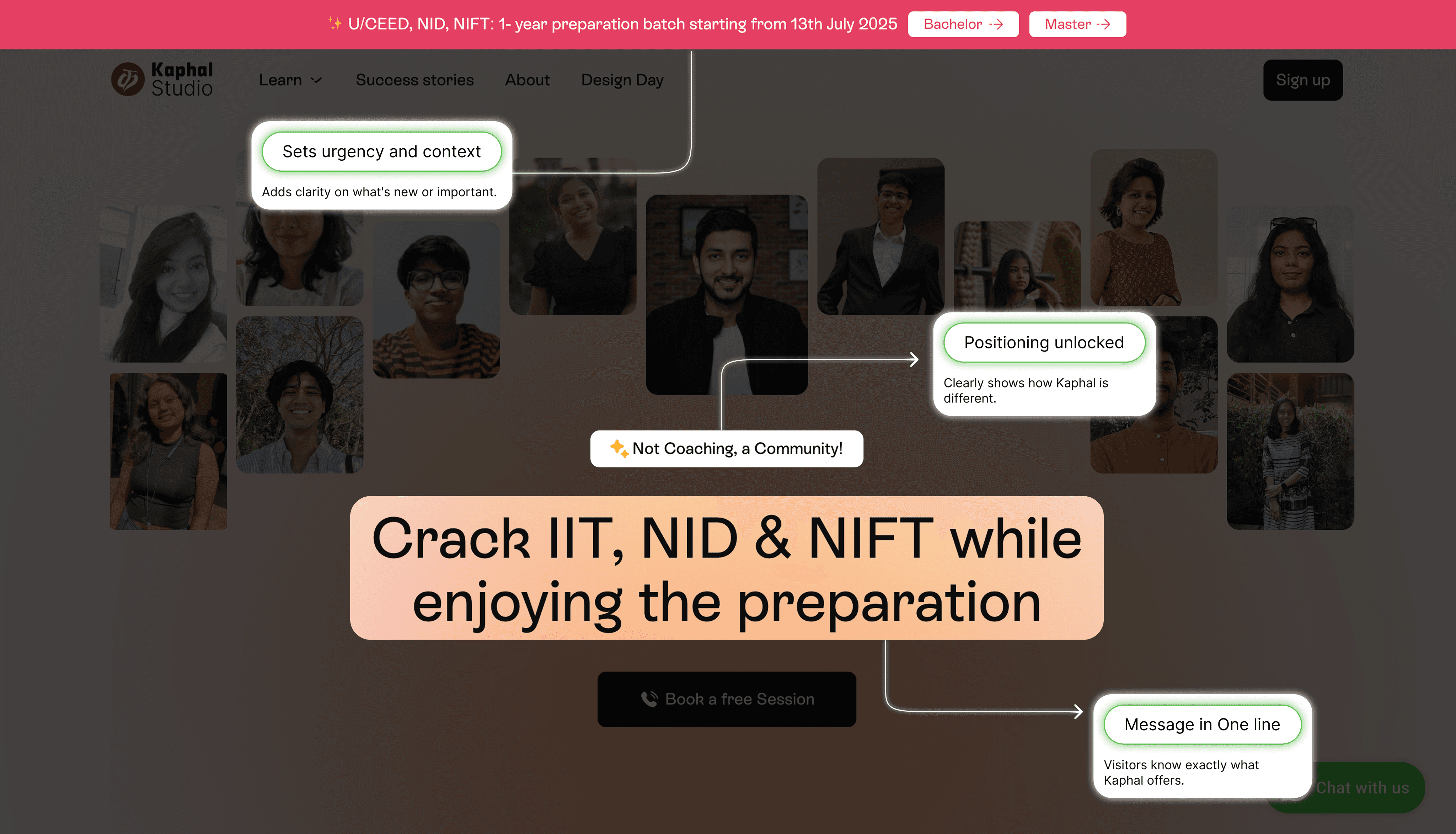
Before → Visitors didn’t “get” what Kaphal does
After → It's clear in the first scroll
Trust
A big challenge was making the site feel credible, especially to parents and first-time visitors.
We added testimonials, team info, and clearer service breakdowns. No fluff, just real proof.
Show Details


Trust is built instantly
Visitors feel like they’re in safe hands
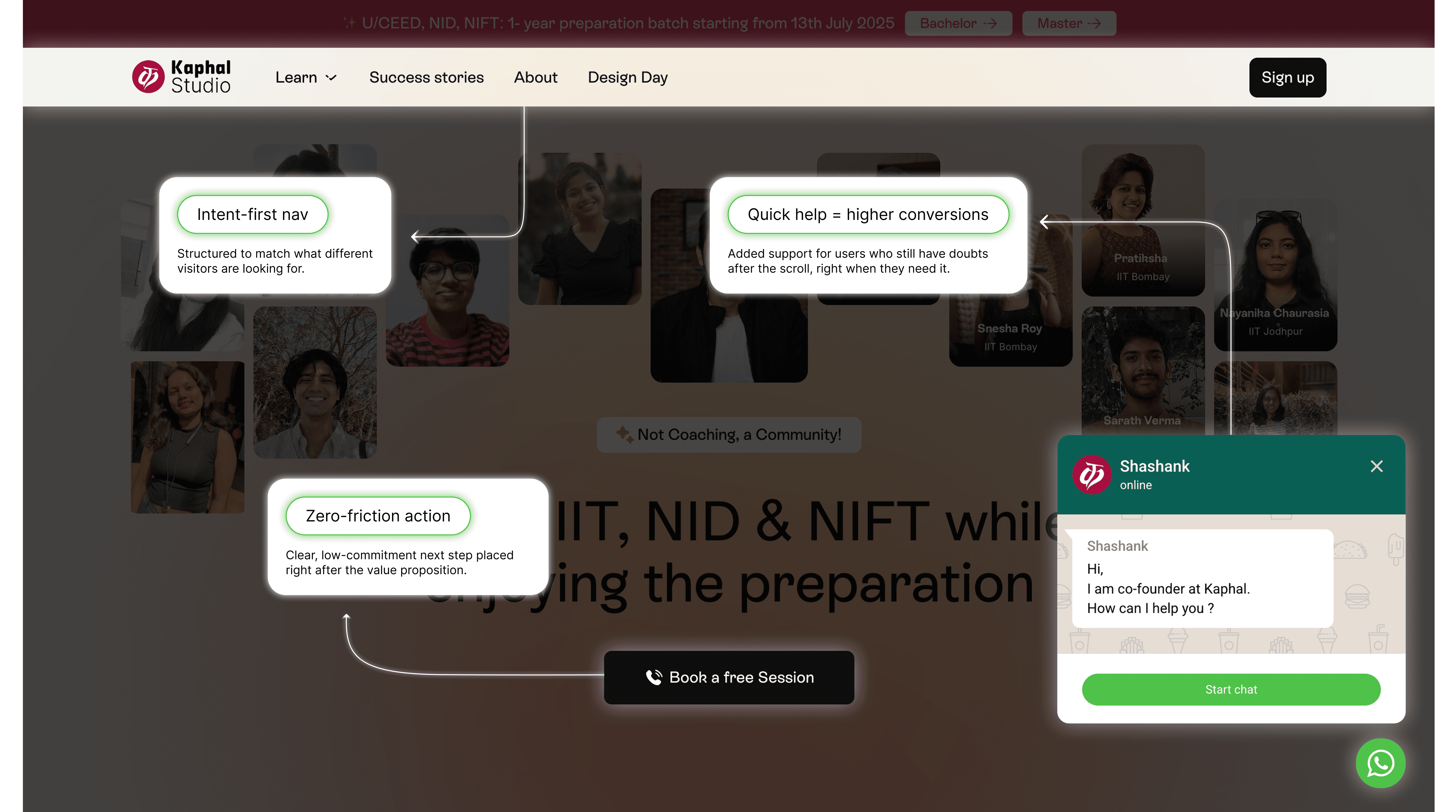
Navigation
We made sure everything important is always just a scroll or click away.
Improved menus, better hierarchy, and sticky CTAs mean users never feel lost.
No dead ends. No second-guessing.
Just a smooth path from curiosity → action.
Show Details

Final Design
The Final Website
Old Website
New Website
01 Homepage motion concept.
IMAGE
The Outcome
What Happened After Launch?
A beautiful website is great. But a beautiful website that performs? That’s the real win.
Within a month of launching Kaphal Studio’s new site, we saw a clear shift, not just in how it looked, but in how it worked.
Increase in average time on site
Visitors understood what to do, faster
More contact form submissions
Learnings
What We Learned
Every project teaches us something, and Kaphal Studio was no different.
Here are the biggest takeaways we’re carrying forward:
Lesson #1
Simplicity > Style
Fancy visuals don’t matter if your message isn’t clear. In the early versions, we focused too much on style, and had to come back to ask, “Would a new visitor understand this in 5 seconds?”
Lesson #2
Team Inputs = Better Output
Some of the strongest sections came out of honest convos with the Kaphal team. We learned how valuable it is to collaborate closely with founders to make sure their voice is felt, not just seen.
Lesson #3
Structure Is Scalable
By putting thought into the content architecture early on, we made it way easier for the team to scale later. Future updates? New services? New launches? No problem, the system’s already there.
Final Thought
Every website we design teaches us how to build the next one better. This one reminded us:
When you mix clarity with creativity, you build trust, fast.
CONTENTS
Highlight
The Problem
The Strategy
Our Process
The Solution
Final Designs
The Outcome
Learnings